This San Francisco Living Room Gets Little Natural Light, But It Feels Airy Like a Ray of Sunshine
Words by Olivia Lidbury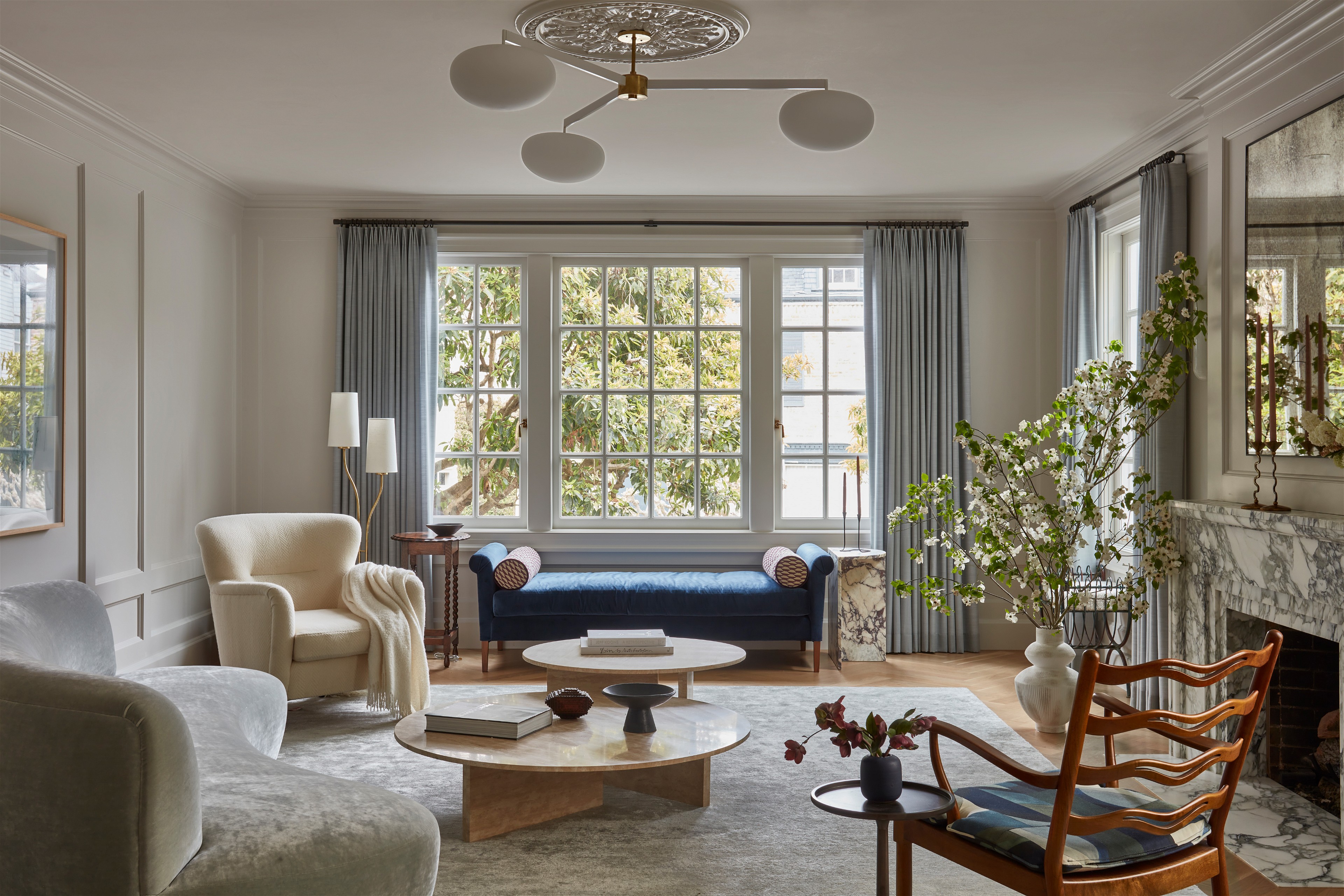
Photography by Michael Clifford; Design by Lauren Nelson Design
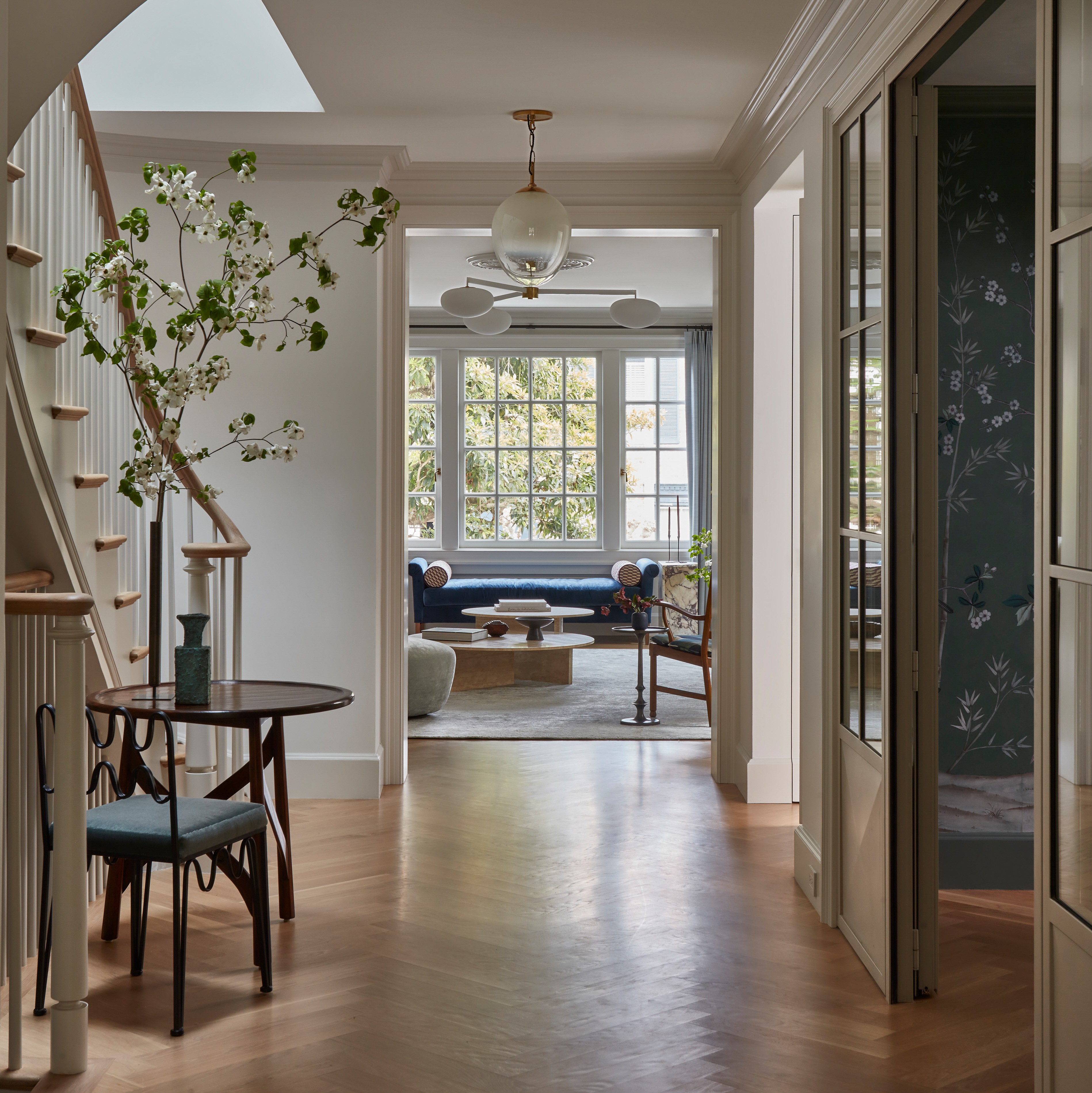
A formal living room with French flair, but make it family-friendly. A dark, north-facing space, but make it light and airy.
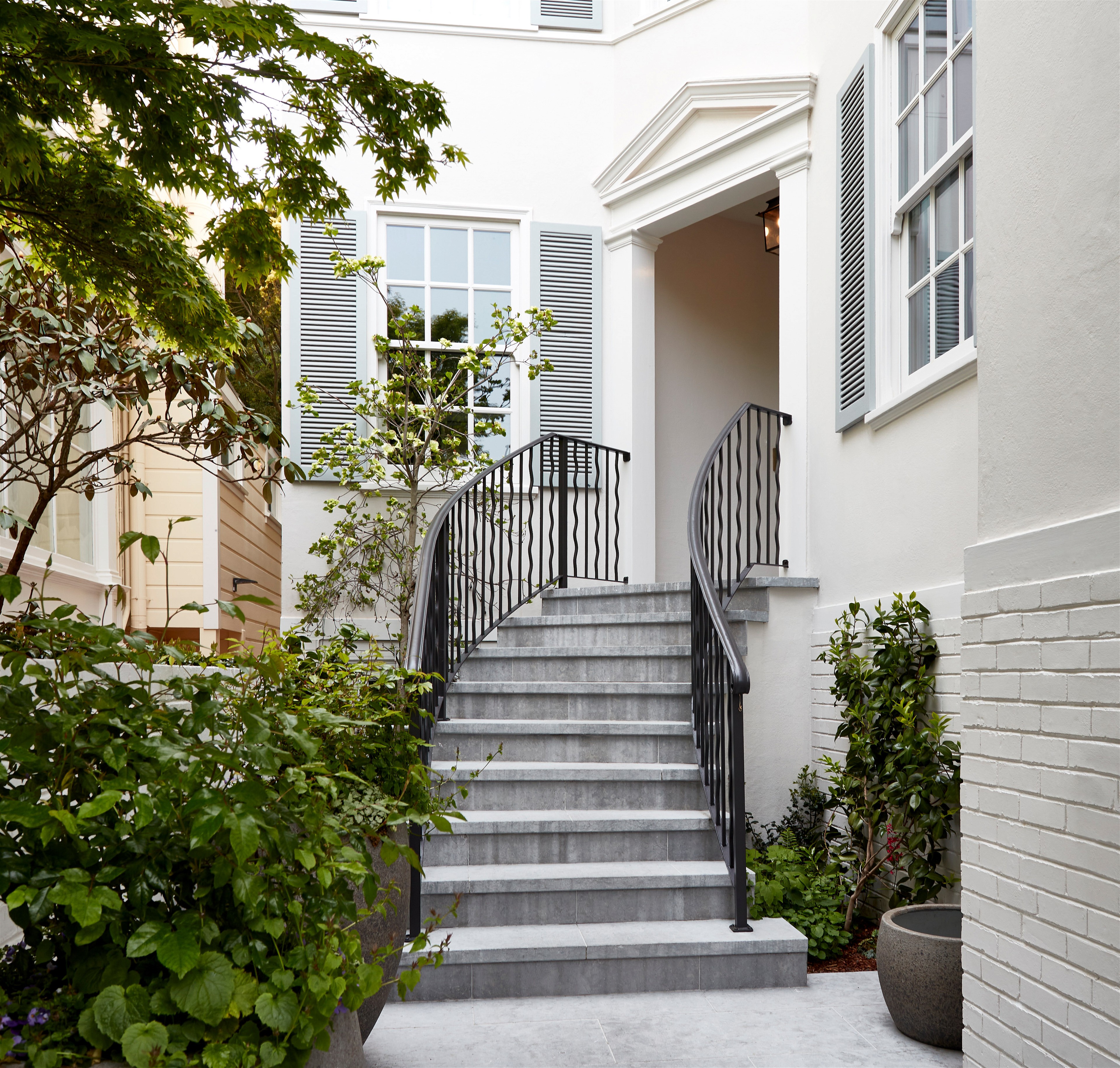
This renovation project in an elegant 1920s Colonial Revival in San Francisco’s Presidio Heights was full of contradicting challenges, but none that Expert Lauren Nelson wasn’t comfortable tackling with aplomb.
Despite having two small children in the mix (who have the run of the kitchen and den downstairs), the owners didn’t want to compromise the space with kid-safe furniture and performance fabrics. “They wanted it to feel special, grown up, and somewhere they'd want to entertain their friends,” says the California-based interior designer.
Photography by Michael Clifford; Design by Lauren Nelson Design
The large area epitomized a blank canvas. Devoid of any original features or character, “it felt a bit naked,” says Lauren. Her solution was to create handsome bones with touches borrowed from the home’s traditional architecture and furnish the room with more modern pieces to create a balance.
Here, the Expert explains how she added integrity to this elegant townhouse, without it feeling too much.
The project: A 1920s Colonial Revival house
The location: Presidio Heights, San Francisco
The room: The formal living room
The client: A professional couple with two young children
Photography by Michael Clifford; Design by Lauren Nelson Design


The element that started it all
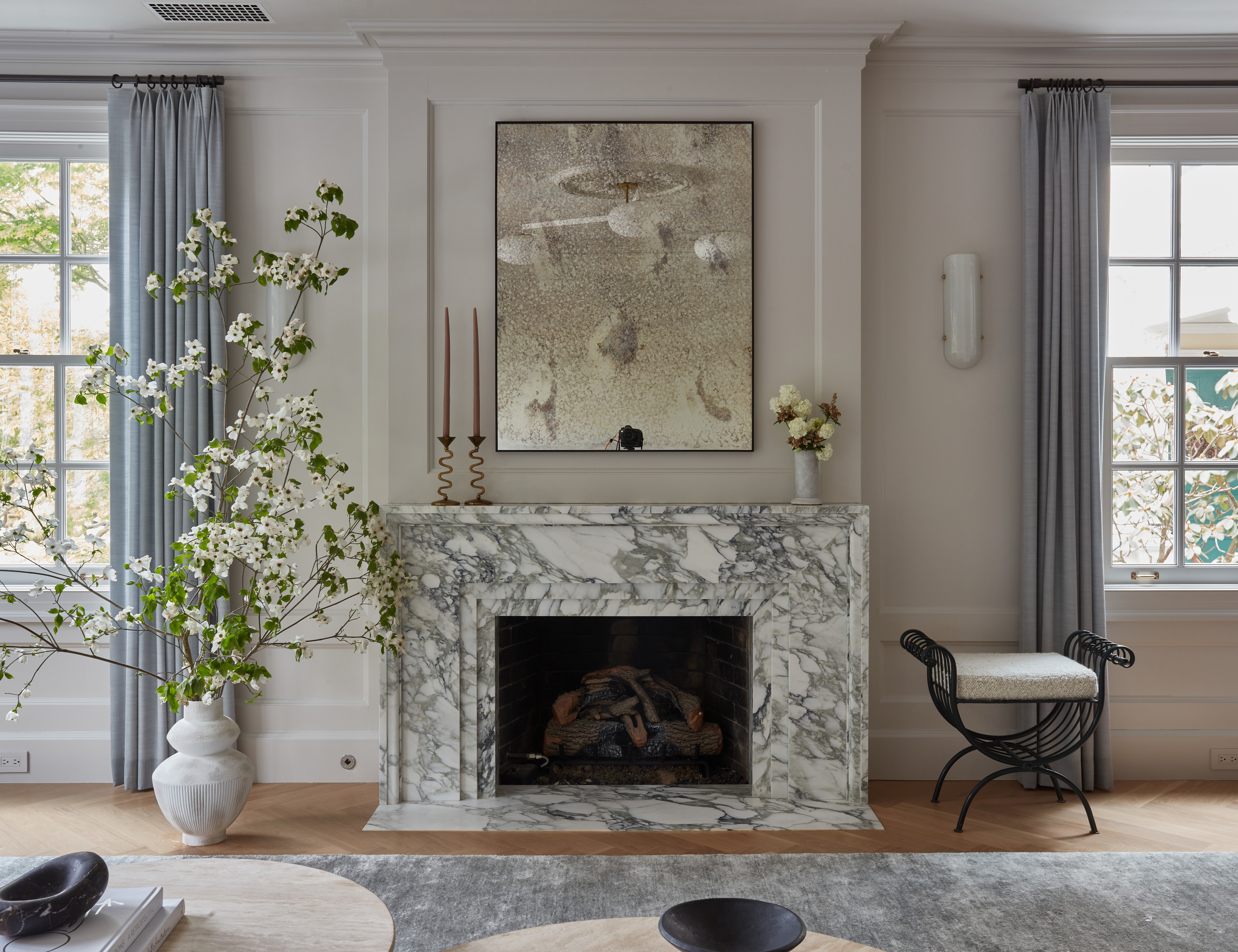
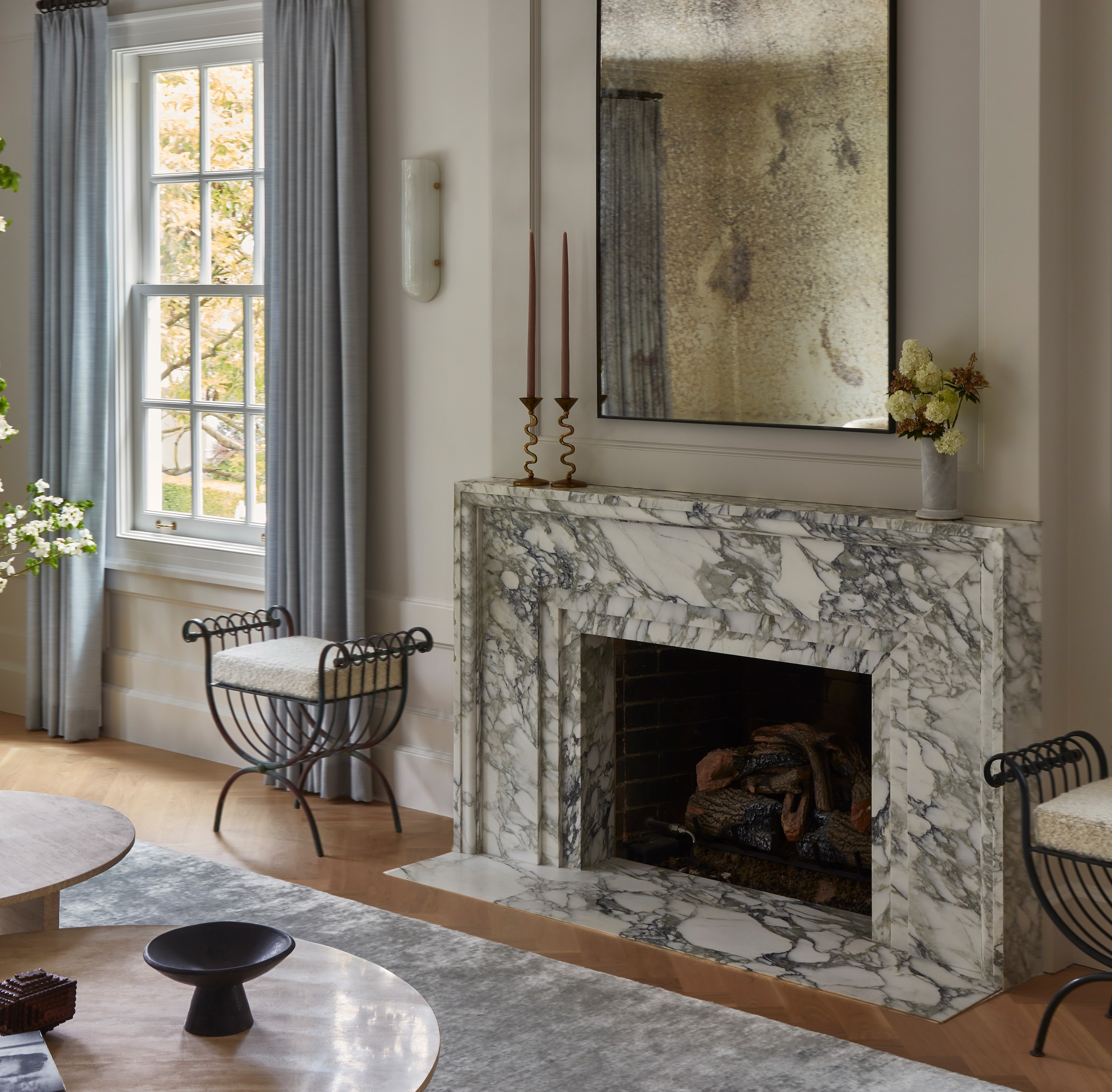
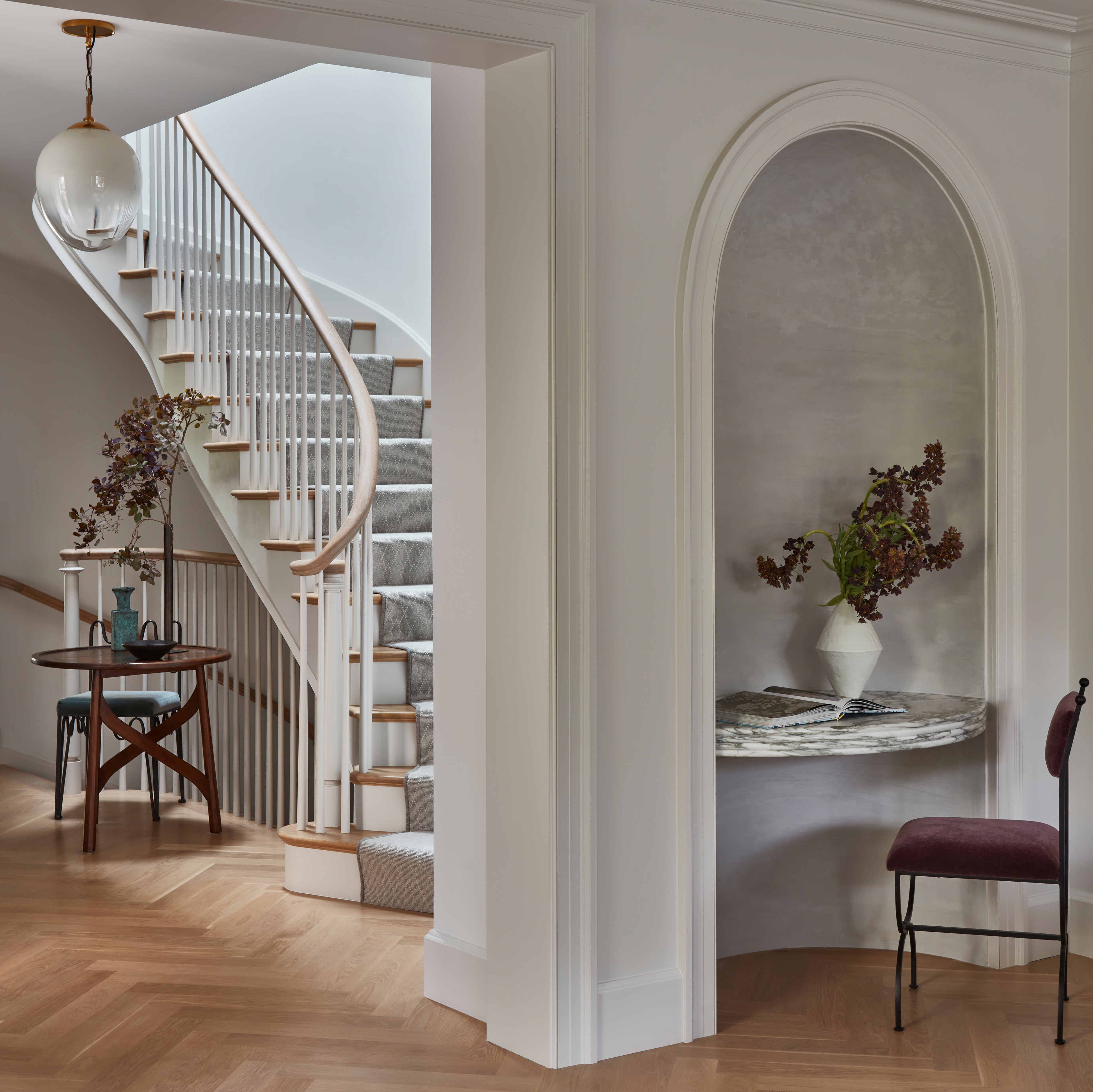
More than fixating on a color palette or individual pieces, I considered the architectural embellishments to make the room’s backdrop feel more special: the paneling, the Arabescato marble fireplace, and the arched niche, which doubles as a small desk.
The biggest problem to solve
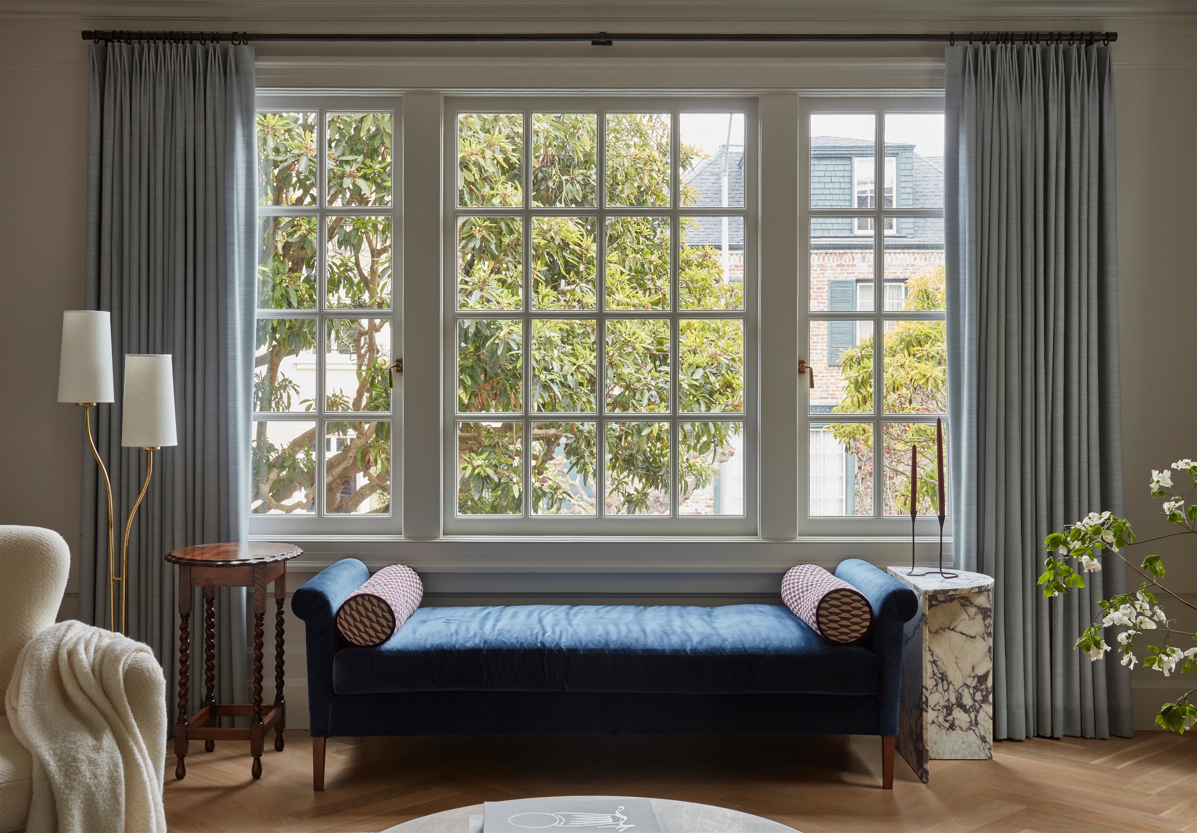
This room is north-facing and on a hill that blocks sunlight, so it’s generally quite dark. The challenge was making it feel light and airy. I leaned into a soft, monochromatic palette of silvery blue-grays with just a few darker pieces and pops of color.
Choosing the right materials was important: the silk in the rug reflects the white off the ceiling, as does the velvet sofa. Meanwhile, the navy daybed by the window—which is what you see when you first walk into the room—helps ground the space.
Photography by Michael Clifford; Design by Lauren Nelson Design

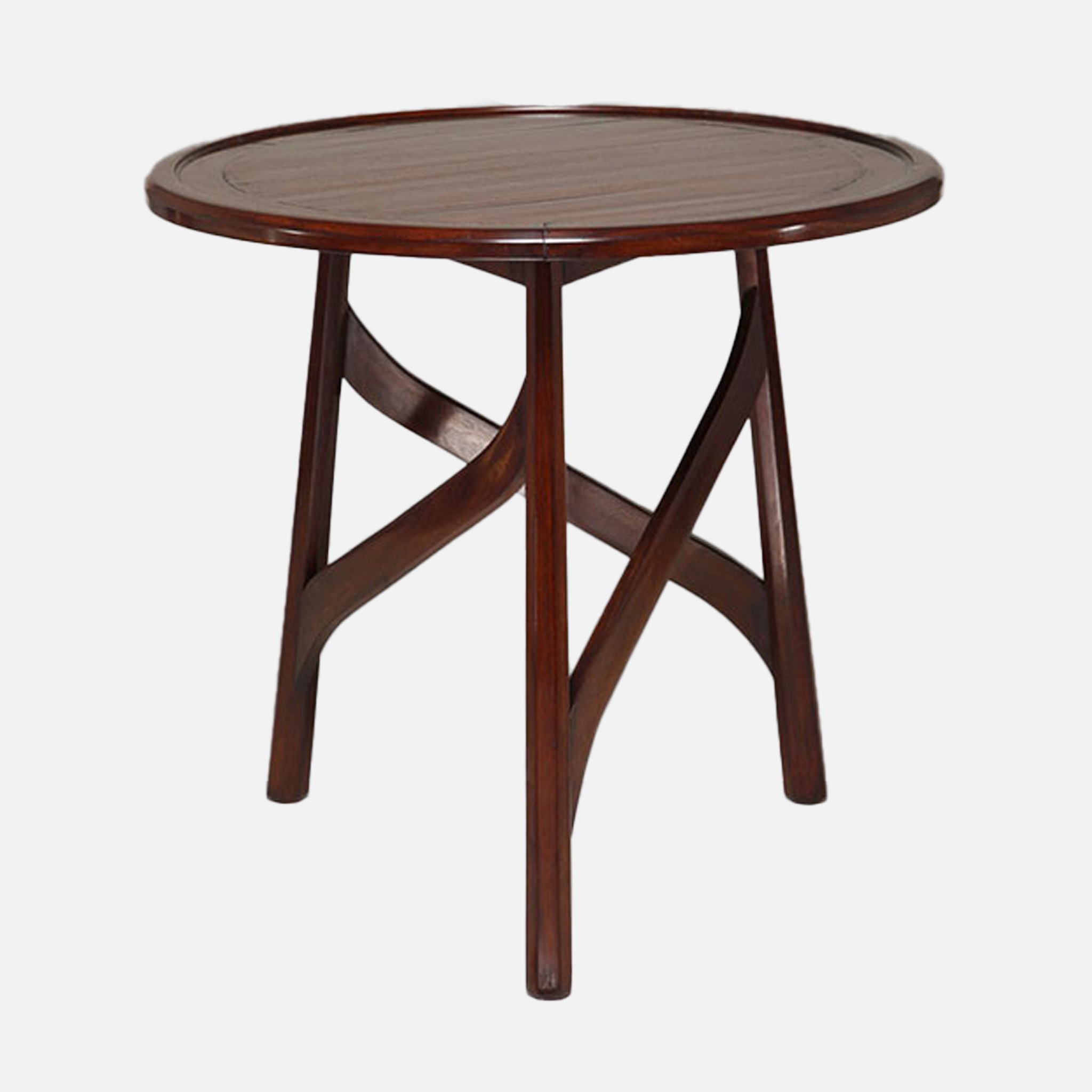
Something vintage
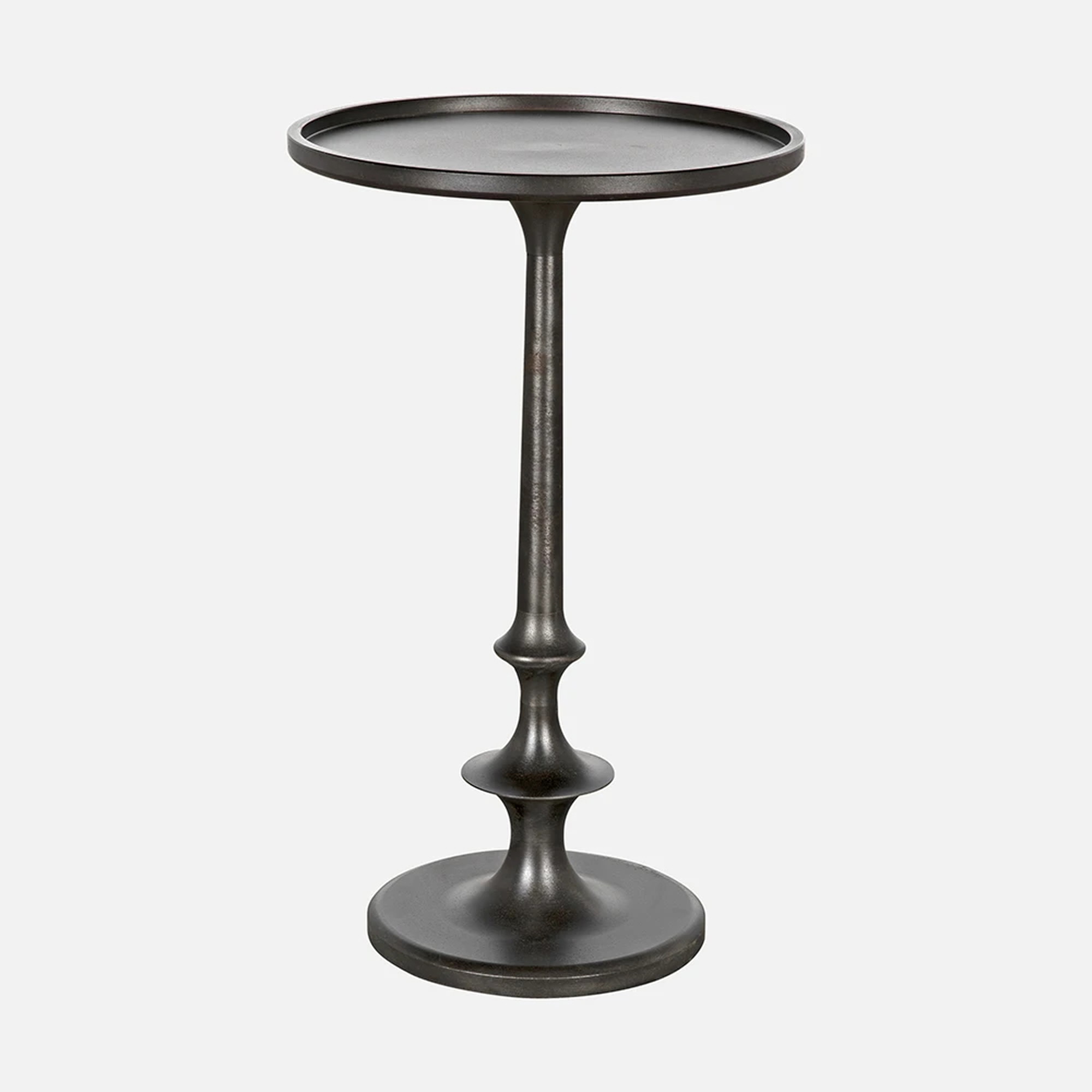
I love using antiques to add character, but also because it’s a way of not having to create a new piece to replace something that’s going to landfill. I love several vintage finds in here, but the ladderback chair by Ole Wancher for Fritz Hansen and the French 1970s iron stools under the windows are some of my favorite finds.
The splurge and steal
The aforementioned ottoman stools weren’t too hard on the budget. But the huge rug— which I designed and had custom-made—was worth the investment!
Photography by Michael Clifford; Design by Lauren Nelson Design
The little detail with a big impact
The arched wall wasn’t a huge undertaking structurally speaking, but it does so much to elevate the room. The original wall was made a little deeper, and the inside of the nook was finished with a Venetian plaster. A wooden desktop would have been a more budget-friendly option, but when I proposed the marble slab to the client, it was a no-brainer. The chair is a new piece that captures that French refinement perfectly.
The biggest learning
I went big on blending different eras and styles to create a unique look. Pairing French and Danish furniture and using an intricate ceiling medallion for a contemporary light fixture proved a valuable reminder to mix a range of classical forms with modern silhouettes for a room to feel layered.
Photography by Michael Clifford; Design by Lauren Nelson Design
I really had to sell my clients on…
More than a particular detail, I had to reassure my clients that splurging on specific pieces was the right move! They didn't want to cut corners, but I was reminding them that this wasn’t a kid-centric area (however if the little ones do hang out here, and everything is cleanable and fixable).
Why this space works so well
There’s a nice flow: you walk into the room without being blocked by anything. There's also a careful balance of color and materiality: tactile fabrics such as silk and velvet against cotton wool help the room to feel more elevated.
The final vibe
Layered, tailored, and calming.
Photography by Michael Clifford; Design by Lauren Nelson Design